Through the strategic utilization of our comprehensive services, ranging from branding to web design, Kim adeptly fashioned a captivating online presence that authentically reflected her vision and distinctive voice. The apex of this effort resulted in a sophisticated logo that resonated effectively with her devoted target markets, complemented by a conversion-driven website. During the course of a fruitful two-month collaboration, she acquired the indispensable tools necessary to flourish in her entrepreneurial endeavors.
Kim approached us with a unique challenge – creating a brand from scratch for her business, which served two distinct and unconventional populations within the market. The first group comprised individuals seeking assistance in rehabilitating their dogs, while the second group consisted of rehabilitation facilities in need of group facilitators to coach clients towards a better quality of life. Our task was to design a logo that effectively represented and addressed the needs of both these diverse target markets.
Collaborating closely with Kim, we meticulously crafted a brand that not only fills her with pride but also impeccably captures the essence of her brand’s voice and message.
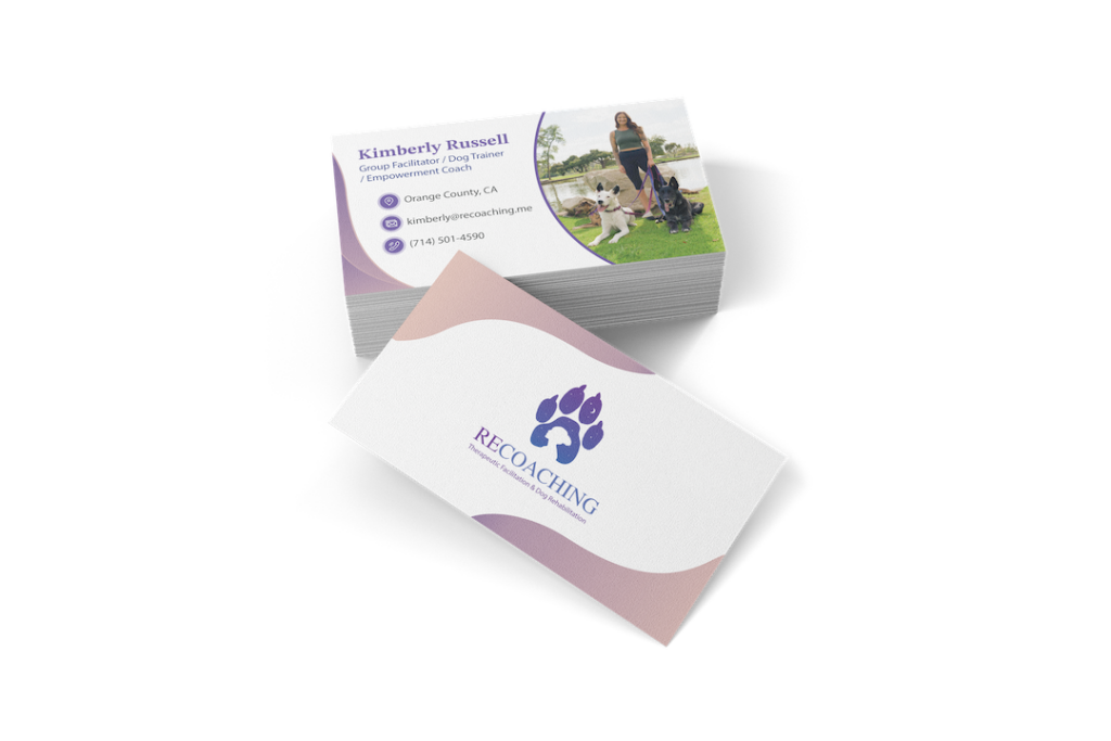
Given the nature of Kim’s work, which demands on-site and hands-on engagement, having a physical card readily available at all times becomes imperative. This way, she can impress her prospects effectively during her interactions.
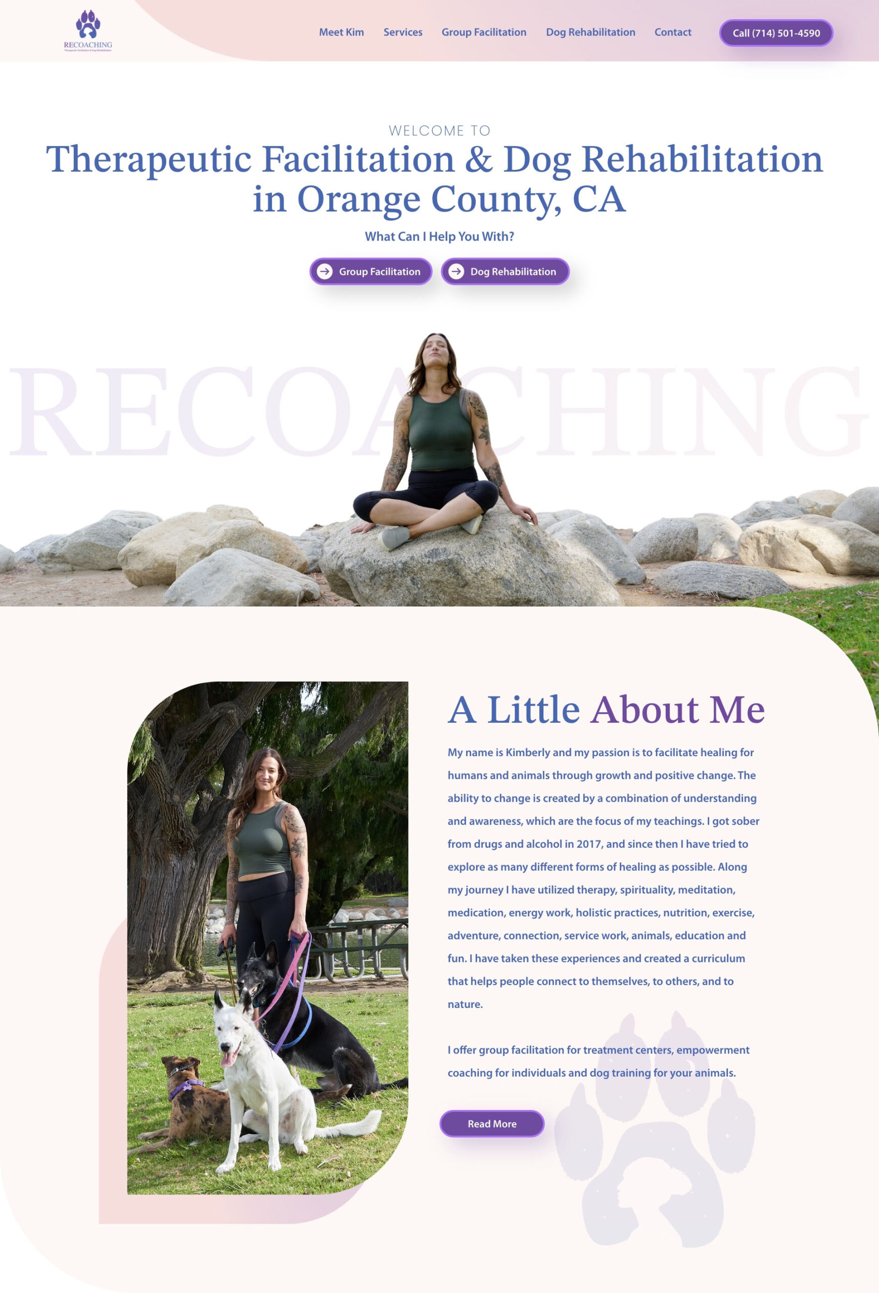
She required a website capable of guiding visitors along their chosen paths of interest while also yielding sufficient conversions. The website had to be captivating and purposeful, providing ample information to empower clients to make informed decisions and reach out to her confidently.
For the logo, a dog’s paw was used as the overall form of the logo mark. This housed a silhouette of a person’s head underneath a moon and stars. Encompassing both ideas into one to help bring about a symbol of respect for both industries.
STIX is used as a font to give off an elegant and sophisticated look to help emphasize the seriousness of Kim’s line of work. People come to her to help better a behavioral problem and this should be reflected in the logo itself.

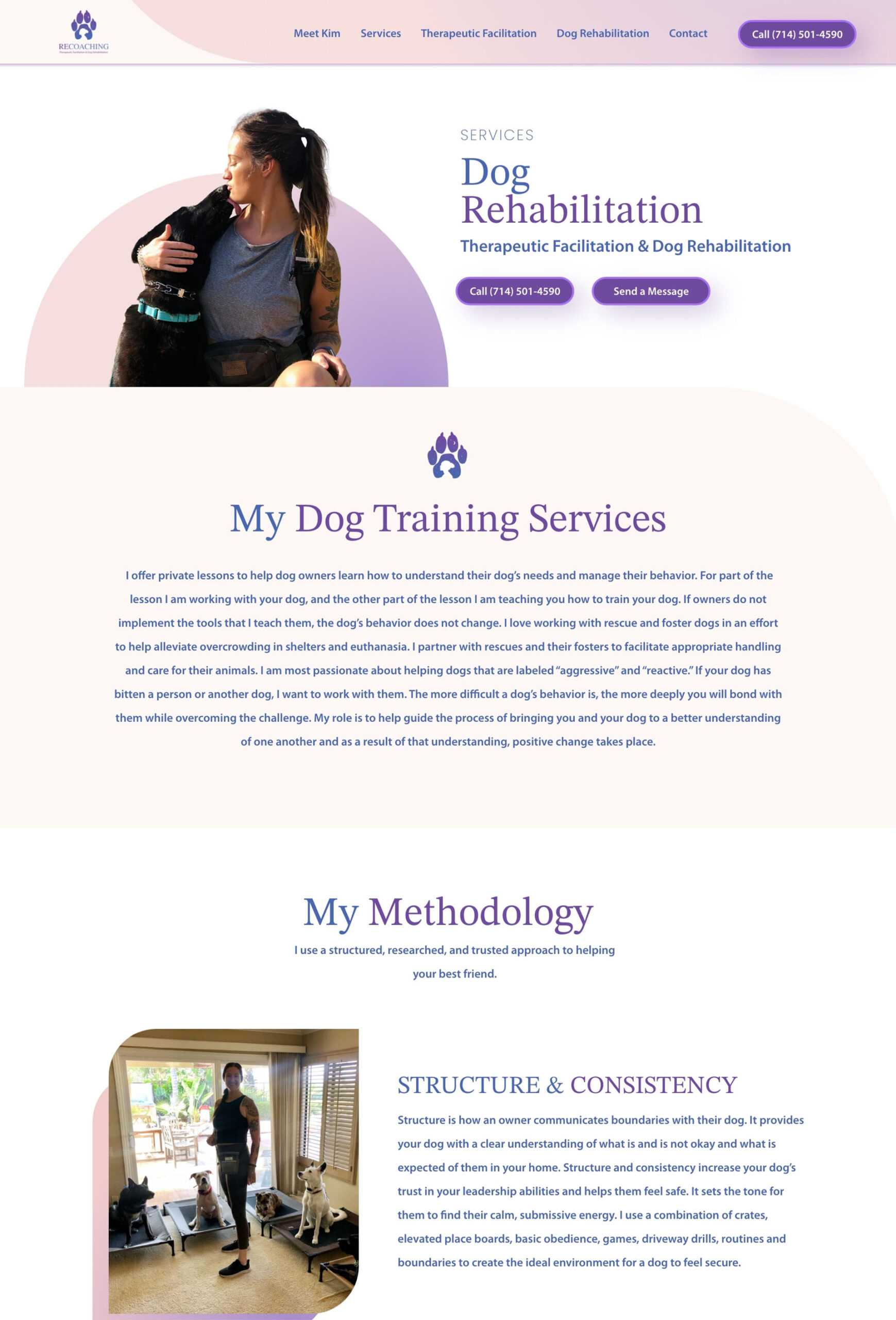
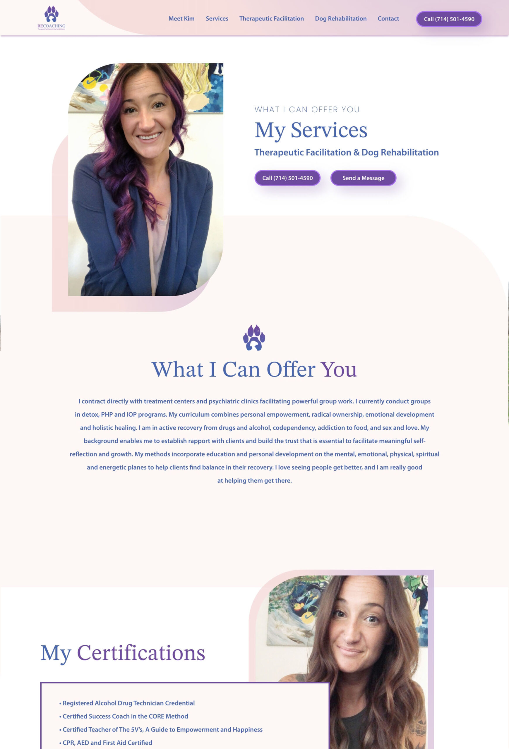
Kim’s website follows a cohesive design approach, mirroring the color scheme and font used in the logo. The logo mark is thoughtfully incorporated as an accent throughout all pages, ensuring a consistent visual identity. With its rounded edges and gentle colors, the website exudes a warm and inviting ambiance, instilling users with hope and a sense of understanding from the moment they arrive.
The user experience is carefully considered, as two clear tracks are presented on the first fold, enabling visitors to easily navigate their path to the information they seek in just a few simple steps. To encourage user engagement, each page is equipped with prominently displayed contact information, including a phone number and a contact form, ensuring a wider reach for capturing conversions. This thoughtful approach to design and usability enhances the overall effectiveness of Kim’s website, creating a positive and user-friendly environment for her visitors.
The business cards are meticulously crafted to maintain brand consistency. They feature Kim’s signature colors, a professional photograph, and all the essential contact information. This cohesive design ensures that each card represents her brand identity seamlessly.
With all aspects in place, Kim possesses a well-defined identity that harmonizes seamlessly throughout her business. Her logo, business cards, and website intricately mirror her true essence and the invaluable assistance she offers to those seeking her services.
Consistent Branding
Meaningful Design
Website Built For Conversions